Sea Icons Case Study
PROJECT BRIEF:
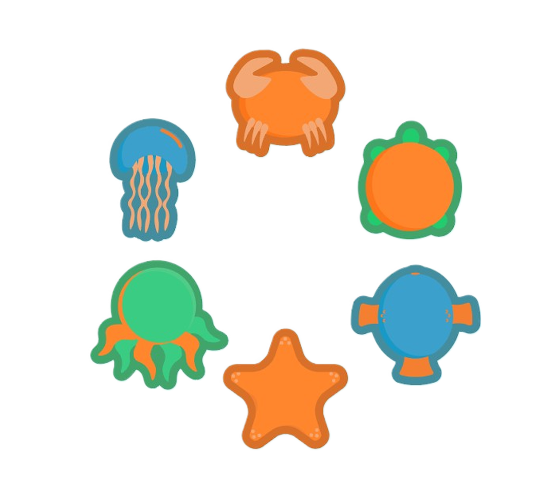
I had a lot of fun with this project, the goal was to create icons to assist a small store with their branding. The store has a very heavy “beach” aesthetic and wanted to tie that into their branding. While they weren’t picky on the type of icon, they wanted it to align with their branding, emphasized wanting the icons to tie together as a set, and that the deadline was two weeks away.
Sketching
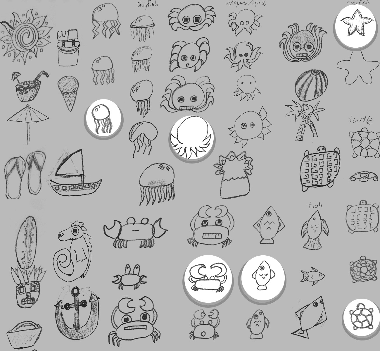
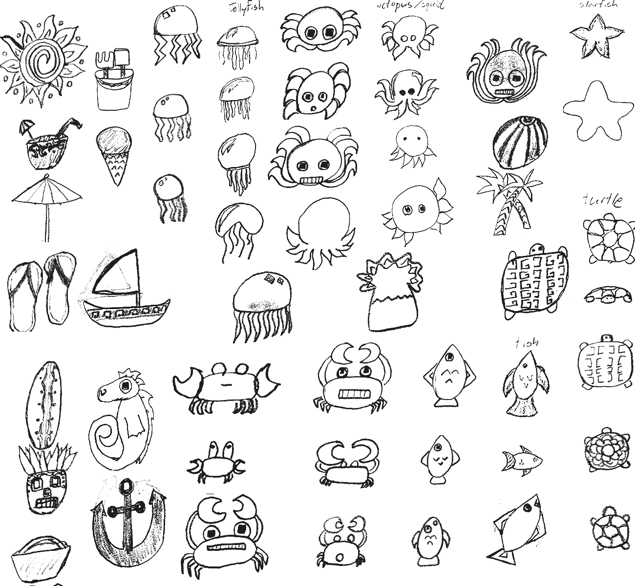
DRAFTS
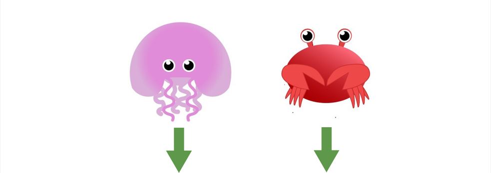

Drafts On Drafts
I was excited about this project and rushed through the sketching phase, resulting in a longer drafting phase. (As you can see below)


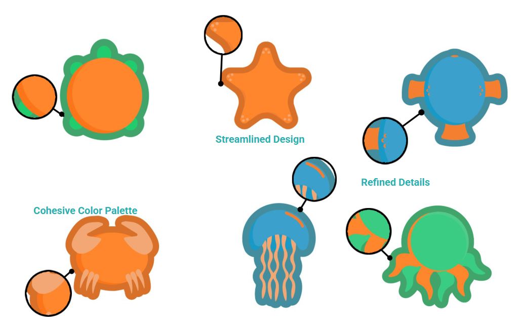
I had begun to feel confident about my designs right when the client rejected them. After a brief moment of complete and utter despair, I asked for some clarification. We came to the conclusion that the main issue was that they didn’t look like an intentional icon set. After making some revisions and choosing a clear color palette, my client loved them.
CONCLUSION:
I really enjoyed creating these guys and agree that the final set is the best. I’d be interested in doing more projects in the future. I design for everything from icons to motion graphics. If you have a project, hit me up. If you’re interested in seeing some other stuff I’ve done, then take a look at my Instagram or Youtube.
Email: skjuttner@gmail.com
Follow